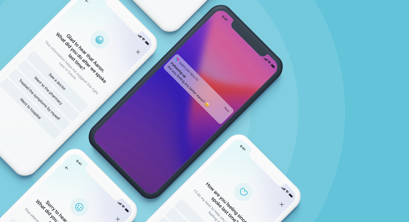
Internal advice website redesign
The goal
- Redesign one of Citizens Advice internal websites, AdviserNet.
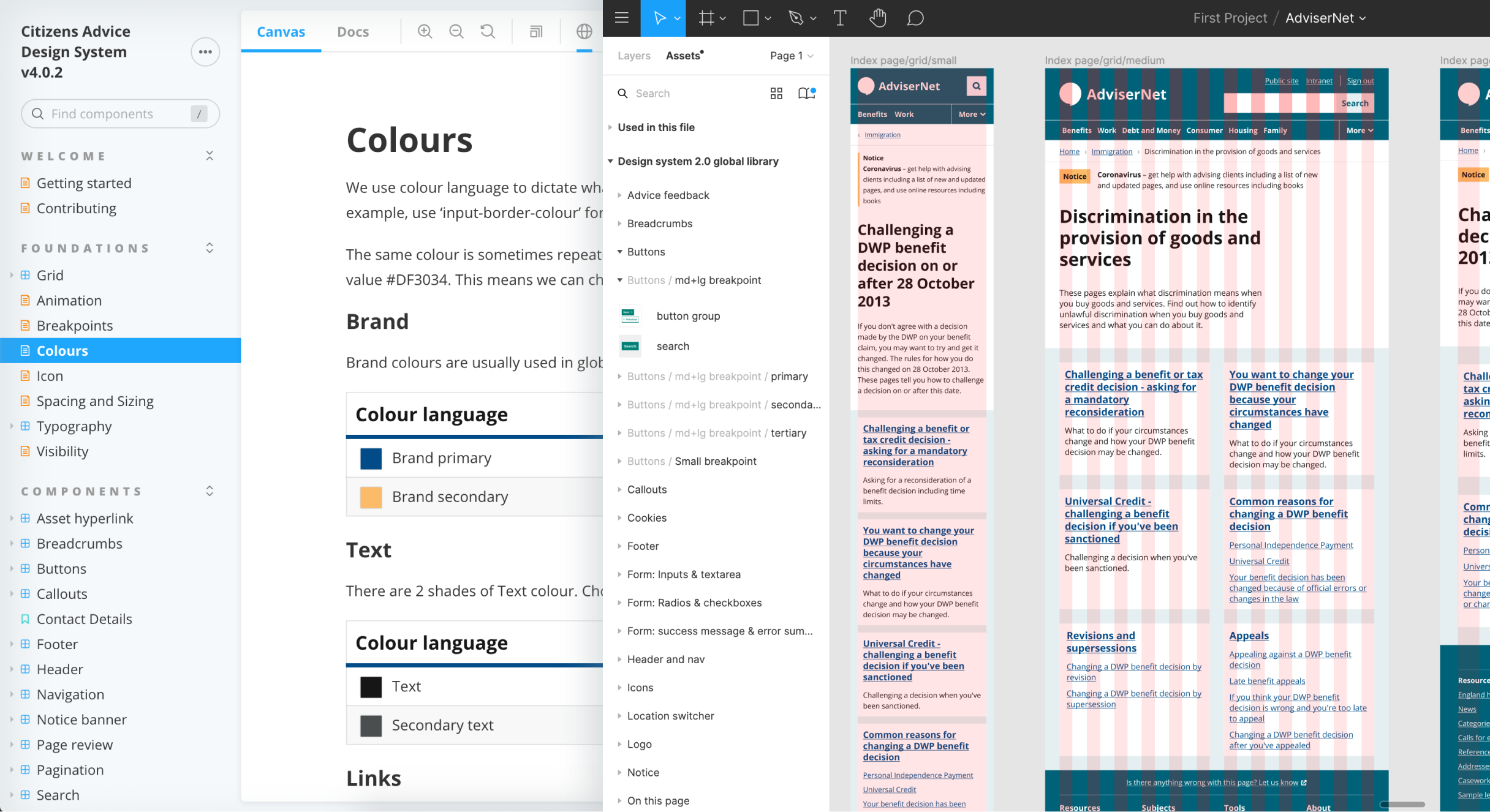
- Consolidate the templates, maintain and create new components to the Design system.
- Ensure the design meets the WCAG 2.1 AA accessibility standard.
My role
- Led and managed the design process.
- Collaborated with a senior product designer to run an accessibility audit.
- Worked with a user researcher to define hypotheses and conduct user testing sessions.
- Paired with developers regularly to do design QA and make sure everything is considered from different perspectives.
Accessible and consistent
The problem
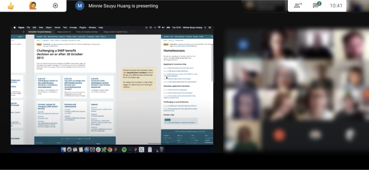
AdviserNet was an internal website that allowed advisers to access the information for any queries and issues from the general public. The website had serious inconsistency and accessibility issues throughout and very difficult to use. The inconsistency made the users have to learn different ways of finding information. Not only did it create confusion for the advisers, but it also slowed them down to find the right information.
So the primary goal of this redesign was to consolidate the templates and create accessible components that meet WCAG 2.1 AA requirements.
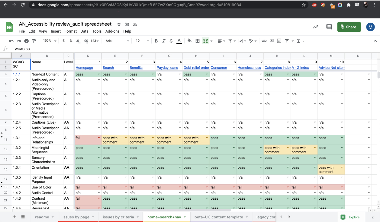
Accessibility audit
To make sure AdviserNet design is accessible, I worked with a senior product designer and conducted an internal accessibility audit. We used automated testing with tools like ‘Wave’, which can identify common issues such as colour contrast. We also conducted some manual auditing, like build-in Voiceover on Macbook, which can uncover screen reader compatibility.
After the audit, we were able to address all the inaccessible issues by redesigning and working with the front-end developers on rebuilding components in the new Design system.
Define user needs
To understand user needs and problems, I frequently spoke to an adviser researcher before the work started. As this researcher had done a lot of work to discover user problems and feedback, I was able to develop concepts and make design decisions based on the research findings and insights.
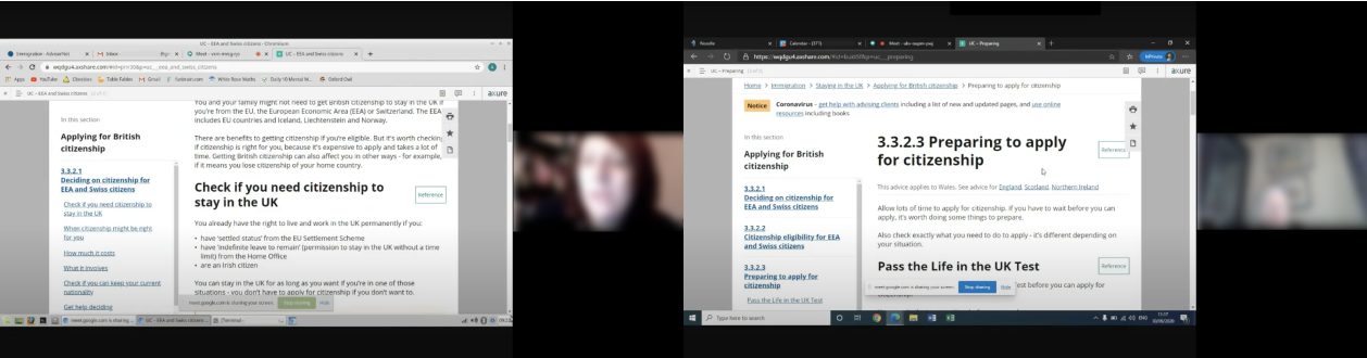
Usability testing
When the design was done, I worked with a researcher to define hypotheses and conduct usability testing sessions. We tested 8 participants in total with a wide range of age, role, and adviser experience. Some of them also had accessibility needs like visual impairment.
The overall feedback we’ve got was very positive. Most of the participants were able to finish the tasks and had no problem with using the redesigned components.
After the testing, I amended the designs based on the findings and feedback.
Implementation
I worked with front-end developers closely by lots of communicating and screen-sharing, especially during design handoff as well as design QA. The close collaboration allowed me to identify any potential issues in the actual environment. It also helped me ensure the implementation was aligned with the design and meet all the accessibility requirements.
Launch
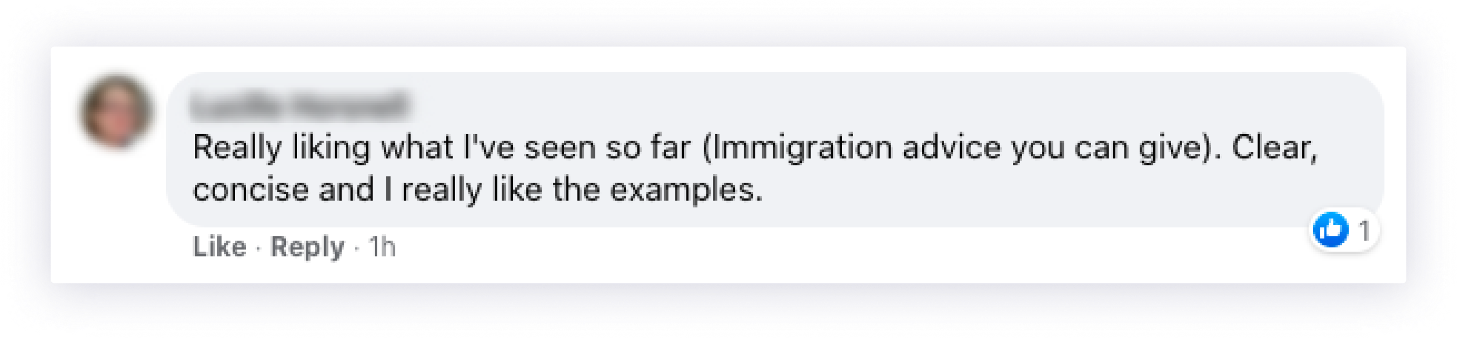
We've launched the new design in the immigration section as the first phase in February 2021 and the feedback we’ve got so far was positive.
There are still some areas that need to be improved in order to provide the best user experience to our users and we’ve been working hard on that. In the meantime, we've moved onto the next section, Family, and started to redesign some features, so stay tuned!